Control Keys

move to next slide (also Enter or Spacebar).
move to previous slide.
 d  enable/disable drawing on slides
 p  toggles between print and presentation view
CTRL  +  zoom in
CTRL  -  zoom out
CTRL  0  reset zoom

Slides can also be advanced by clicking on the left or right border of the slide.

Graphical User Interfaces

  • short: GUI
  • User interfaces allow human-computer interaction by graphical components
  • Applications are represented as windows
  • The window content is composed of graphical components, also known as "widgets"
  • Using the graphical components, information is entered and displayed
  • Interaction with graphical controls is usually via mouse and keyboard; nowadays often via touch screen

The Beginning

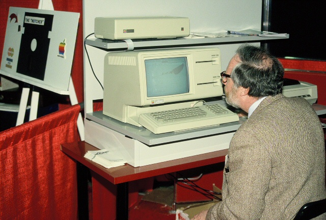
In the early 80s the first devices came into the market with a graphical user interface and mouse input, such as


apple_lisa
Apple Lisa

Application as a Window

paint_window
Title bar
Window frame
Icon of the application
Minimize/maximize the window
Source: Screenshot of the application "Paint" from Windows XP

A Blank Sheet of Paper

  • Many applications that are used to create creative content, start with a blank "canvas" and a palette of tool icons
  • Examples: MS Word, MS Powerpoint, Photoshop, etc.
  • Often it is possible to have multiple documents open and to edit them simultaneously

A Blank Sheet of Paper

paint_window
Blank sheet
User generated content
Tool icons
Menu bar
Source: Screenshot of the application "Paint" from Windows XP

Easy Access

  • The advantage of tool icons over menu bars is the fast access with just one mouse click
  • One goal in the GUI design of an application is, among other things, to allow quick access
  • Frequently used actions should be quickly available, others may require more clicks
  • Experienced users frequently use keyboard shortcuts, such as CTRL+C for copying (respect system standards!)

Design of GUIs depends on the application's purpose

  • Depending on the purpose, a GUI looks differently:
    View content, search in a database, create new content, solve a specific task
  • Example: A simple video or image viewer only requires very few control elements
  • Example: : If the path for solving the task is known, the user can be guided step by step
db

Grouping Components

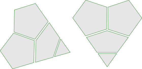
The Gestalt psychology mentions some laws to group components


  • Law of proximity
  • Law of similarity
  • Law of continuity
  • Law of simple shape

Law of Proximity

Closely placed objects belong together


paint_help

Law of Similarity

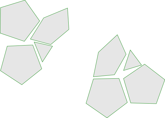
Objects with the same color, shape, size, orientation, etc. belong together


paint_help

Law of Simple Shape

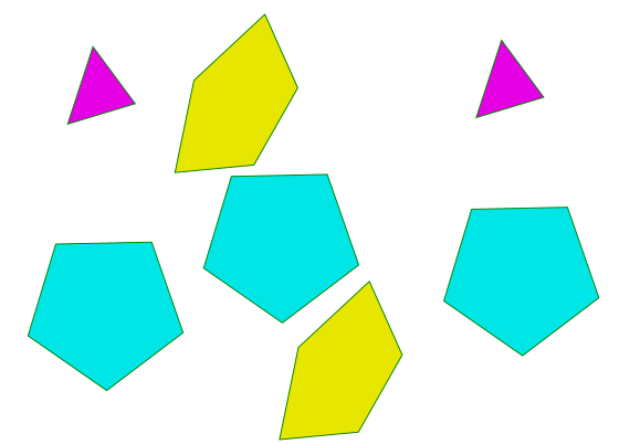
Components are grouped if they form together a simple shape


paint_help

Law of Continuity

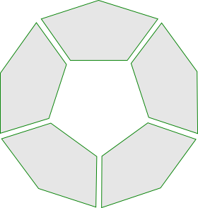
Small components are grouped into larger objects if lines/curves can be proceeded continuously


paint_help

Graphical Components (Widgets)

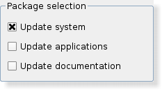
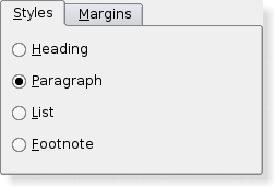
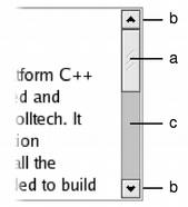
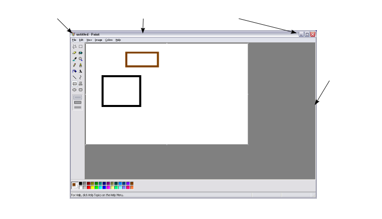
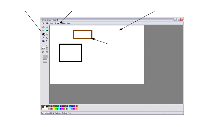
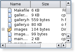
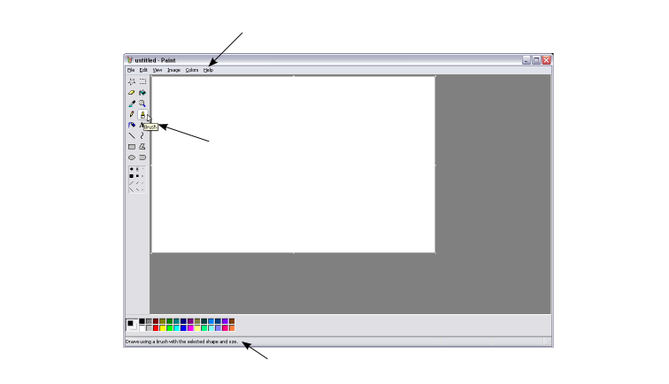
Different types of widgets


  • Components that can trigger an action
  • Components that query an input
  • Components that visualize content
  • Components that group something
  • Components that change the size or the visible section

Components that can trigger an action

Typically, an executable function is associated with these components that is called when the component is activated


  • Button
  • Menu bar and menu items
  • Context menu
  • Toolbar
  • etc.

Example: HTML <button> element      

Components that query an input

These components may call, for example, an executable function when they are edited


  • Text input field ui_lineedit
  • Sliderui_slider
  • Comboboxui_combobox
  • Spinbox/Spinner ui_spinbox
  • Radio buttonui_spinbox
  • Checkboxui_spinbox
  • etc.
Source: Images from Qt Reference Documentation

Components that visualize content

  • Label ui_label
  • Progress bar ui_progressbar
  • Listsui_lineedit
  • Trees
  • Tables
  • etc.
Source: Images from Qt Reference Documentation

Components that group something

  • Groupbox
ui_groupbox
  • Tab control
ui_tabwidget
  • etc
Source: Images from Qt Reference Documentation

Components that change the size or the visible section

  • Scroll bar
ui_label
  • Size grip
ui_label
  • etc.
Source: Images from Qt Reference Documentation

Eight Golden Rules of Interface Design

from: Shneiderman, B. 1998. Designing the user interface. Strategies for effective human-computer interaction. 3. Edition, Addison-Wesley, New York

  1. Strive for consistency
  2. Enable frequent users to use shortcuts
  3. Offer informative feedback
  4. Design dialog to yield closure
  5. Offer simple error handling
  6. Permit easy reversal of actions
  7. Support internal locus of control
  8. Reduce short-term memory load

Undo

  • Undo is usually implemented with a stack
  • Every action of the user is pushed on the stack
  • If the user wants to undo actions, these are successively popped off the stack and for each popped action the reverse function is executed
  • This implies high overhead for the programmer because the reverse function must be implemented in addition
  • In case of a lossy function (deletes data) the corresponding data must be stored
  • Therefore, the stack typically has a defined maximum size

Longer Computations

  • While longer computations are executed, a progress bar should be displayed ui_progressbar
  • This gives the user a prediction of how long the computations will be running and encourages to wait
  • Longer calculations should be interruptible by the user at any time
  • After an abort, the application should be in the identical state as before (working on temporary data structures)
  • Ideally, longer calculations should run in the background (not always useful if this allows the user to change the state/data)

How to Provide Help

paint_help
Help menu
Tooltips
Status bar
Example: HTML-Tooltip (hoover mouse pointer over box)
Source: Source: Screenshot of the application "Paint" from Windows XP

Are there any questions?

questions

Please notify me by e-mail if you have questions, suggestions for improvement, or found typos: Contact

More lecture slides

Slides in German (Folien auf Deutsch)